Adaptive web design and Progressive Enhancement
- By
- PostedAugust 30, 2013
IT'S ALL ABOUT THE USER, NOT THE BROWSER or THE TECHNOLOGY
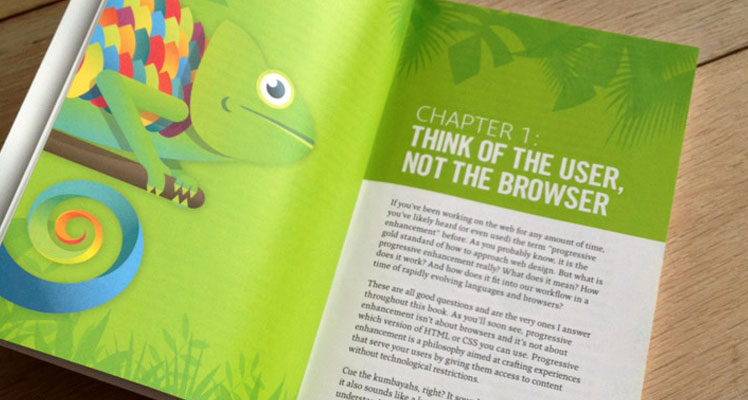
THINK OF THE USER, NOT THE BROWSER If you’ve been working on the web for any amount of time, you’ve likely found out (or even used) the term “progressive enhancement” before. It is the gold standard of how to approach web design. But what is progressive enhancement really? What does it mean? How does it work? And how does it fit into our workflow in a time of rapidly evolving languages and browsers?
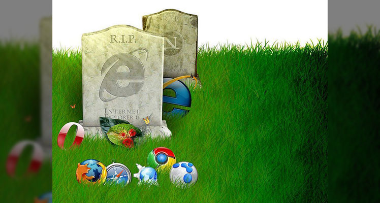
ADAPT OR DIE And when it gets right down to it, progressive enhancement relies on one principle: fault tolerance. Fault tolerance is a system’s ability to continue to operate when it encounters an unexpected error. This property makes it possible for a lizard to regrow its tail and for a brain to reroute neural connections after a trauma. Nature has shown herself quite adept at fault tolerance and, following her example, we’ve incorporated that concept into our own worlds. For example, the oft-lauded “smart grid” can automatically avoid or mitigate power outages by sensing (and in some cases anticipating) system problems.
So can our WebriQ CMS and our web designs.
If you use the web, whether as your professional canvas or just as a casual consumer, you benefit from fault tolerance all the time. Not only is it baked into the protocols that route a request from your web browser to the server you’re trying to reach, it is sewn into the very fabric of the languages that have made the web what it is today: HTML and CSS.
As dictated by the specifications for these two languages, browsers must ignore anything they don’t sympathize. That simple requirement makes progressive enhancement possible.
Some other interesting view of fault tolerance is how it allows for development. Again, looking to nature, you can see this in areas where climate or other environmental factors have caused enough of a change that organisms are forced to adapt, move, or die. THINK OF THE USER, NOT THE BROWSER HTML and CSS have a lot in common with the Galapagos finches. Both were designed to be “forward compatible,” meaning everything we write today will work tomorrow and next year and in ten years. They are, in a sense, the perfect finch: designed to thrive no matter how the browsing environment itself changes. These languages were designed to evolve over time, so web browsers were instructed to play by the rules of fault tolerance and ignore anything they didn’t understand. This gives these languages room to grow and adapt without ever reaching a point where the content they ensconce and style would no longer be readable or run the risk of causing a browser to crash. Fault tolerance makes it possible to browse an HTML5-driven website in Lynx and allows us to experiment with CSS3 features without worrying about breaking Internet Explorer 7. Understanding fault tolerance is the key to understanding progressive enhancement.
Fault tolerance is the reason progressive enhancement works and makes it possible to ensure all content delivered on the web is accessible and available to everyone. As fault tolerance has been a component of HTML and CSS from the beginning, you’d think we would have recognized its importance and value when building our websites. Unfortunately, that wasn’t always the case, but it surely is with WebriQ.
THE RISE OF TOLERANCE
Over time, smart folks working on the web began to realize that graceful degradation’s emphasis on image over substance was all wrong. They saw that graceful degradation was directly undermining both content availability and accessibility. These designers and developers understood that the web was intended for the distribution and consumption of content— words, images, video, etc.,—and began basing all of their markup, style, and interaction decisions on how each choice would affect the availability of that content. By refocusing their efforts, developers began to embrace the fault tolerant nature of HTML and CSS as well as JavaScript- based feature detection to enrich a user’s experience.
They began to realize that a great experience needn’t be an all-or-almost-nothing proposition (as was the case under graceful degradation), but instead web technologies could be applied as layers that would build upon one another to create richer experiences and interactions.
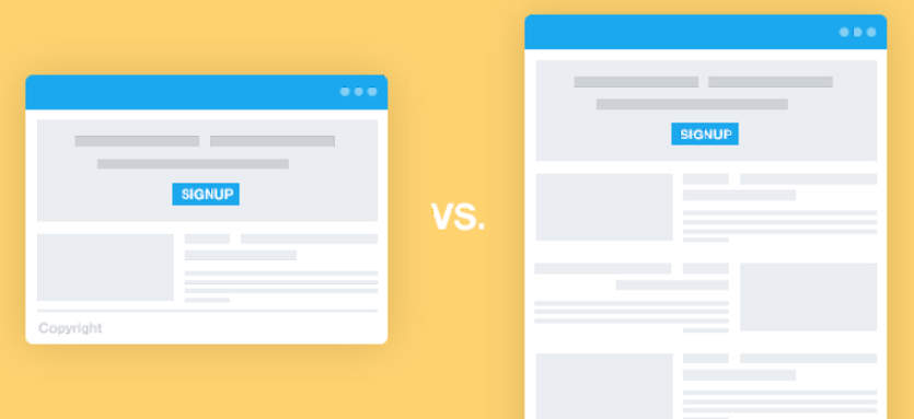
The content-out approach The web is all about information. Every day, on every site, information is disseminated, requested, and collected. Information exchange has been crucial to the growth of the web and will no doubt continue to drive its continued expansion into just about every facet of our daily lives. As such an important aspect of the web, fostering the exchange of information, should be our primary focus when constructing any web interface. Progressive enhancement ensures that all content (that is to say the information contained in a website) is both available to and usable by anyone, regardless of her location, the device she is using to access that information, or the capabilities of the program she is using to access that content. Similarly, content collection mechanisms—web forms, surveys, and the like— also benefit greatly from progressive enhancement because it ensures they are universally usable and, hence, better at doing their job. Fundamentally, progressive enhancement is about accessibility, but not in the limited sense the term is most often used. The term “accessibility” is traditionally used to denote making content available to individuals with “special needs” (people with limited motility, cognitive disabilities, or visual impairments); progressive enhancement takes this one step further by recognizing that we all have special needs. Our special needs may also change over time and within different contexts. When I load up a website on my phone, for example, I am visually limited by my screen resolution (especially if I am using a browser that encourages zooming) and I am limited in my ability to interact with buttons and links because I am browsing with my fingertips, which are far larger and less precise than a mouse cursor. As we’ve covered, sites built with graceful degradation as their guiding principle may work great in modern browsers, but come up short when viewed in anything less than the latest and greatest browsers for which they were built. In a non-web sense, it puts the user in a position where, like a young child at an amusement park, she may miss out on a great experience because she isn’t tall enough to ride. Similarly, users without the “right” browser will likely experience issues (and errors) accessing the site’s content, if they can access it at all.
By contrast, a website built following the philosophy of progressive enhancement will be usable by anyone on any device, using any browser. A user on a text-based browser like Lynx won’t necessarily have the same experience as a user surfing with the latest version of Safari, but the key is that she will have a positive experience rather than no experience at all. The content of the website will be available to her, albeit with fewer bells and whistles, something that isn’t guaranteed with graceful degradation. While philosophically different, from a practical standpoint progressive enhancement and graceful degradation can look quite similar, which can be confusing. To bring the differences into focus, I like to boil the relationship between the two philosophies down to something akin to standardized testing logic: all experiences that are created using progressive enhancement will degrade gracefully in older browsers, but not all experiences built following graceful degradation are progressively enhanced.
Limits? There are no limits. During the heyday of graceful degradation, websites became very much like the amusement park I mentioned earlier: “you must be this high to ride.” The web was (and, sadly, still is) littered with sites “best viewed in Netscape Navigator 4” and the like. With the rise of progressive enhancement and web standards in general, we moved away from that practice, but as more sites began to embrace the JavaScript technique known as Ajax, the phenomenon resurfaced and many sites began requiring JavaScript or even specific browsers (and browser versions) to view their sites. It was the web’s own B-movie sequel: The Return of the Browser-Breaking, User- Unfriendly Methods We Thought We’d Left Behind. Over time, the fervor over Ajax died down and we began building (and in some cases rebuilding) Ajax-based sites following the philosophy of progressive enhancement. Then along came Apple’s HTML5 Showcase with its pimped out CSS transitions and animations. When we finished wiping the drool off our desks, many of us began incorporating these shiny new toys into our work, either because of our eagerness to play with these features or at our clients’ behest. Progressive enhancement isn’t about browsers. It’s about crafting experiences that serve your users by giving them access to content without technological restrictions. Progressive enhancement doesn’t require that you provide the same experience in different browsers, nor does it preclude you from using the latest and greatest technologies; it simply asks that you honor your content (and your users) by applying technologies in an intelligent way, layer-upon-layer, to craft an amazing experience. Browsers and technologies will come and go. Marrying progressive enhancement with your desire to be innovative and do incredible things in the browser is entirely possible, as long as you’re smart about your choices and don’t lose sight of your users.
Progressive enhancement = excellent customer service Imagine, for a moment, that you are a waiter in a nice restaurant. Your job (and your tip) depends upon your attention to detail and how well you serve your customers. One measure of your attentiveness is how empty you let a customer’s water glass become before refilling it. An inattentive waiter might let the glass sit empty for several minutes before refilling it. Someone slightly more on the ball might only let it hit the halfway mark before topping it up. A waiter who excels at meeting his customer’s beverage needs would not only make sure the water level never fell even that far, but he would even manage to refill the glass without the customer even realizing it. Whose customers do you think walk away the most satisfied? And, if we’re judging solely based on satisfactory hydration, who do you think is likely to get the best tip? As web designers and developers, we should strive to be as good at our job as that attentive, unobtrusive waiter, but it isn’t a simple task. Just as a waiter has no idea if a customer coming through the door will require frequent refills or few, we have no way of knowing a particular user’s needs when they arrive on our site. Instead, we must rise to meet those needs. If we’re really good, we can do so without our customers even realizing we’re making special considerations for them. Thankfully, with progressive enhancement’s user and content-focused approach (as opposed to graceful degradation’s newest-browser approach), this is easily achievable.