Biggest eCommerce Trends To Stay Afloat in 2016
- By
- PostedJanuary 8, 2016
For the eCommerce industry, 2015 was a great year. E-commerce sales worldwide grew from $1.3 trillion in 2014 to $1.4 trillion in 2015. And, it is expected that retail commerce sales is going to be even better in 2016. In fact, according to an online report, “e-commerce sales will boost by 50 percent this year.”
However, the continuous increase in e-commerce consumption by people has also led to rise in the competition for retailers. The best way to stay abreast of competition is to optimize your e-store according to the latest trends. Now, when it comes to e-commerce, several on-going trends are expected to stay afloat in 2016.
Below are some of the biggest trends that will dominate in the e-commerce industry in 2016:
1. Wider Adoption of Responsive Design
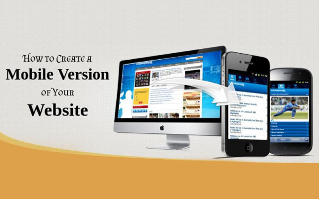
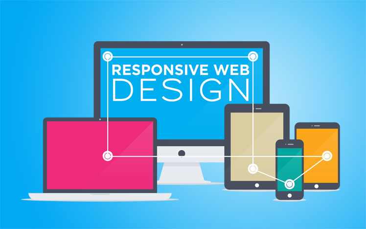
Nearly 66 percent of user's time spent on e-shops is done using mobile devices. And, 61 percent of consumers abandon an e-commerce site if it isn’t mobile-friendly. Thus, it's imperative that your online shop must be optimized for Smartphones and tablets. Put it simply, having a site adjusted to multiple devices with different screen sizes has become a hard-to-ignore priority than ever before. This clearly suggests that the adoption of responsive design is only going to grow rapidly.
Despite offering a streamlined viewing experience, responsive design has been implemented in only nine percent e-commerce sites. However, realizing the significance of responsive design, more and more e-commerce website owners are turning to RWD approach.
2. Flat Design: “When Less is More”
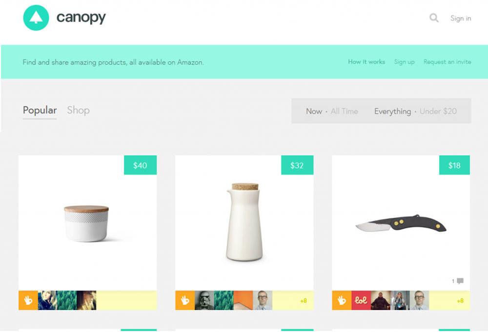
Most e-commerce stores are usually cluttered with stylistic elements like gradients, textures, and drop shadows, to name a few. But using such elements decreases usability. And so, many e-commerce sites owners have started following the “Less is more” motto to make their site user-friendly. Basically, retailers are making use of flat design templates to bring clarity and simplicity to their design. Rather than using stylistic elements, a flat design includes subtle elements, including bold colors, iconography, grid and much more.
One great example of flat styling is Canopy. You can use this site to get inspiration for applying flat design to an e-shop – that features a clean and minimalistic design with plenty of white space that quickly brings the user focus on the products.
3. Use of Split Screens Will Increase
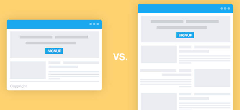
In case you want to give prominence to a few products (ideally two products) simultaneously, on your e-commerce site then you can make use of split screens to fulfill such a need. Besides, helping you promote two of the most important items in your store, split screens also provide another benefit. You can showcase your primary product on the side of the layout, and on the opposite side, you can display additional information about that product.
For example, bellroy.com (a site that sells wallets and several other accessories) is designed with split screens. Below is an image of the site containing a passport sleeve on one side of the product page, while the right side is used for displaying a travel wallet.

4. More Finger-Friendly Interfaces
As people prefer mobile devices for making purchases online, it's important that your site can enable visitors to interact with a web page in a seamless manner. One best way to achieve such an objective is to make your e-commerce site interface more finger-friendly. Well, since consumers have become accustomed to using fingertips for interacting with a page, apparently they'll possibly would want to use multi-touch gestures for navigating through your e-commerce site.
E-commerce website interfaces designed keeping in mind finger friendliness will most likely have two impacts. Firstly, the use of content sliders will reduce. Though such sliders have proved quite useful in showing plenty of information in small screen displays, but users find it hard to click on the small-size next buttons of the content sliders. Secondly, use of larger CTAs will increase as they help provide an enhanced shopping experience to users.
5. Add a Personalized Touch With Custom-Drawn Illustrations
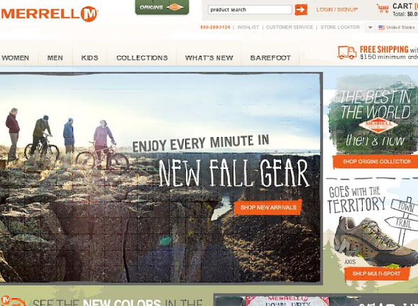
In today's highly competitive e-commerce industry, site owners resort to several techniques and tactics that could help in making their e-shop look unique and a personal touch to it. And, one emerging trend that can assist you in accomplishing such a goal is to make use of hand drawn (custom) illustrations. Thus, you should consider adding hand-drawn stickers to your e-commerce site instead of the stickers available online. Also, you must think about adding a large illustrated background.
For example, Merrell uses a fully illustrated background that not just add a realistic touch to the layout, but also help deliver the site's message in an interactive yet easy-to-understand manner. Despite using plenty of illustrations, this e-commerce site doesn't compromise on usability.
Some Other E-commerce Trends Worth Watching in 2016
- You will observe an increase in the use of mobile wallets (or e-wallets), which will motivate providers of such technology to make substantial improvements in their product.
- Based on a report by Cisco, “Videos will account for 69% of the Internet traffic coming from e-commerce by 2017.” With such rapid increase in consumption of mobile videos, it's clear that embedding videos (of your product) on your e-commerce site will become a lot more prominent in coming years.
- The need for creating good typography is on a rise, and this trend isn't going to abate anytime soon. This trend has already been implemented in e-commerce sites like the Yellow Bird Project, Design By Humans, etc. You can expect more and more retailers are focusing on improving typography of their e-shop.
Wrapping Up
The competition in the e-commerce industry in getting more and more intense since the majority of consumers prefer making a purchase online. However, you can create an edge over your competitors by adjusting your e-store according to the design trends mentioned above. All of the trends discussed in this post might not be new, but they'll still remain the most dominating e-commerce trends in 2016.
Samuel Dawson is a trained developer in Front End Development and CMS. He is working with Designs2html Ltd – HTML to WordPress Conversion service company. He has his own glorious story where he has done a lots of struggle. He likes the programming, code and other CMS technology.

