Benchmark for E-commerce success
- By
- PostedMarch 31, 2015
Your website should inspire TRUST
People won’t buy from a site that they can’t trust. Plain and simple. When a website is devoid of accepted trust elements, you will have fewer converting customers.
To put that into ordinary language — … if it looks bad… it doesn’t matter how much your product rocks. Nobody wants to buy from a site that doesn’t inspire their trust.
- Web 1.0 doesn’t inspire trust.
- Rotten UX doesn’t inspire trust.
- Blurry graphics don’t inspire trust.
- Broken links and 404s don’t inspire trust.
- Unresponsive design doesn’t inspire trust.
In a word, there are a variety of things on a website that scream to a user: DON’T TRUST ME. DON’T SPEND YOUR MONEY HERE!
The Importance of Trust
Users _must_trust the site from which they purchase.
According to Unbounce.com, a paltry 65% of brands show security information on the purchase page during checkout. If there aren’t any security logos, guarantees, pictures, rave testimonials, contact information, or similar comforting signs, people get the eerie feeling that they need to jump out of this scam and go shop at Amazon.
How to Inspire Trust
It’s not as hard as it may seem. Here are three simple ways to improve the trust factors on your site.
Reveal product reviews
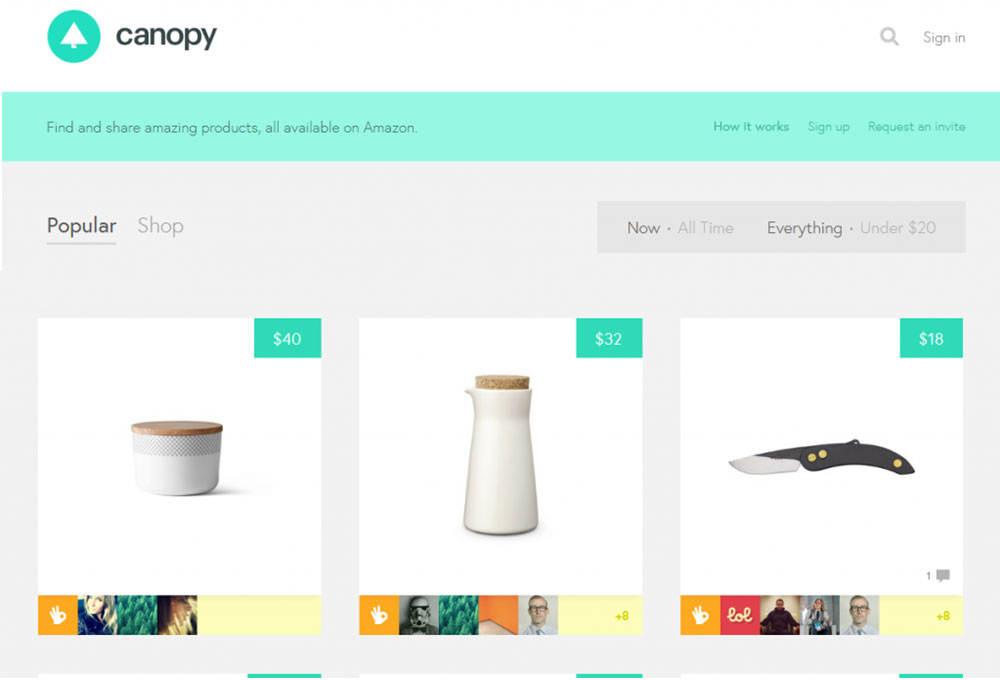
Transparency inspires trust, and in the e-commerce world, it’s all about product reviews. People will obviously trust what other customers say about you more than what you say about yourself. When you provide full disclosure, it cultivates a sense of trust on your entire site.
Amazon knows trust factors. Right next to most products, they place the number of reviews and glittering gold stars that tell the world how much this product is loved. There’s something trustworthy about buying a device that thousands of other people think is worthy of a five-star rating.
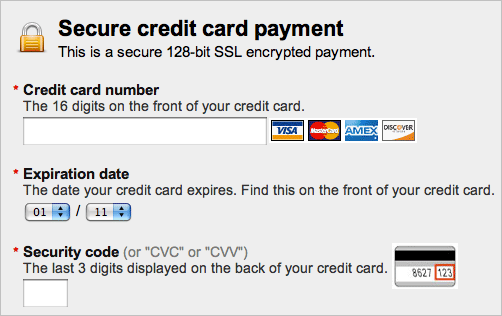
Use recognized verification symbols.
As we’ll discuss later in this book, certain symbols are trust markers. The presence of these value-add images on a site give visitors and shoppers the sense of _bona fide_they need to go through with a purchase.
Trust factors usually look familiar — logos, a lock icon, etc.— and help to inspire a degree of confidence in your site.
Tell your customers that you can be trusted.
There’s no harm in just telling it how it is. Let people know, in plain language, that you care about being trustworthy. Whether you’re endorsed by agency XYZ, or have a membership with TrustNetwork 123, you can simply state the facts about your validity.
Your Website should be EASY to USE
Another major contributor to the success of your E-commerce site is the usability of your site. If potential customers have problems accessing, navigating, or otherwise using your site, they will become frustrating with your shopping cart.
Podcastfaq.com defines site usability as “how easy it is for visitors to use the site, navigate and understand the content. If your site was created in 1985, is not responsive, takes four years to load, don’t be surprised that you are not successful.
In order to _buy_your products, people need to be able to _usethe site’s checkout process._
When dealing with the issue of web usability, keep this in mind: The customer doesn’t want to think about the process. They simply want to do.
They have enough on their mind. Things like, Can I afford this? Do I need this? Is it the best one? They don’t want to add in a fresh layer of concern: “Why isn’t the back button working? Where do I enter the CV code? Why do I have to enter my address twice?
Make the process so smooth and seamless that they proceed without even thinking about it.
Remember when self-checkout registers first came out? We may never know how many people left piles of merchandise sitting on the hulking shelves of those clunky machines. Shoppers simply walked away because the things didn’t work!
Your site may be doing the same thing. Some of the things we discuss below touch on usability, but suffice it to say that your site must have intuitive flow with no rude and aggravating surprises as the shopper proceeds through the checkout process.
Usability has an end goal: conversions. The easier your site is to use, the more conversions you’ll score. It’s just that simple.
Tips for Enhancing Your Site Usability
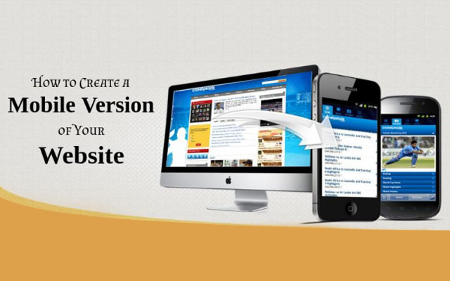
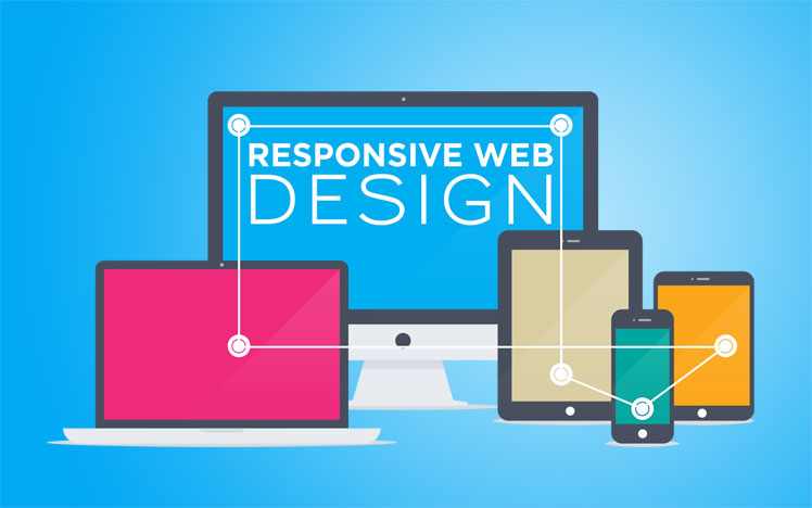
Make your site completely responsive.
Keep in mind that anywhere from 15–40% of your customers are visiting your site by way of a small screen. These mobile visitors constitute a huge conversion channel. If your site isn’t 100% responsive, you’re playing fast and loose with thousands of dollars in revenue. These people will be bidding _adieu_the minute that shopping cart cramps their mobile style.
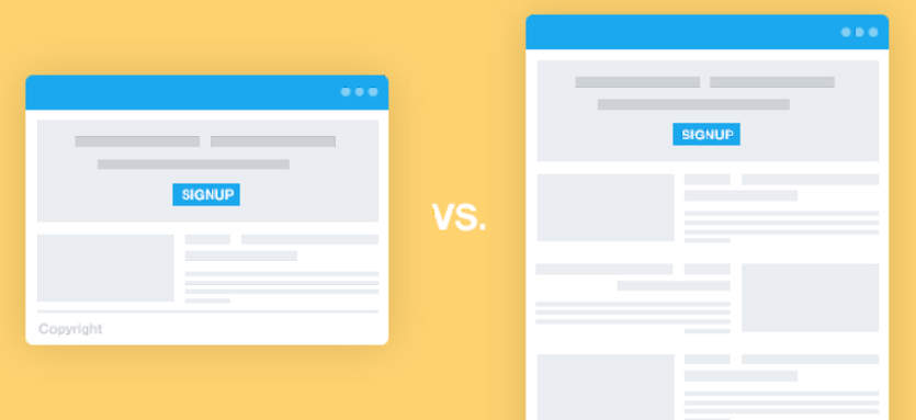
Keep it simple.
The more links, clutter, words, and junk on your site, the more you will impede your visitors’ progress to the checkout counter. Keep your site free of everything that gets in the way. A distracted visitor is a lost conversion.
Make your menu prominent.
A site’s navigation is one of the most noticeable features of its usability (or lack thereof). Keep a site’s menu options available from everywhere on the site, and make it obvious.
Ensure optimal speed.
It’s common knowledge that a slow website will shoot your SEO, your conversions, and your credibility. But let’s take this point a little bit further. Sometimes, a site’s speed screeches to a crawl in the checkout phase.
Why does this happen? Whether it’s shoddy payment API or just screwy site design, it needs to stop. You can’t afford to lose customers at the most critical moment just because your site decided to compete for the slowest-loading-website-of-all-time award. Make sure your website has top-notch sizzling speed at _every phase,_especially at the checkout.
Your call to action is critical.
Finally, don’t be bashful when it comes to your call to action. This is the most important aspect of your page. It is the gate to the checkout. Show people where it is — big buttons, large fonts, contrasting colors, whatever it takes.
This is your time to shine. Give them a firm nudge in the right direction. You’re not being rude. You’re being courteous by providing good usability.
Check out process should be easy and simple
1. Make your checkout linear.
We’re going to talk about linear vs. nonlinear checkouts. Hang on tight while I get mildly technical.
Christian Holst describes an uncomplicated checkout process as “completely linear.” A linear checkout process flows in a straight line from start to finish. This linear process is intuitive. It’s expected. The user knows what’s going on at each steps and is confident about what is going to happen next.
A nonlinear checkout process, by contrast, has steps within steps. Instead of proceeding in a straight line, the process might take a rabbit trail so that the user can create an account, register on the site, finagle some stupid shipping arrangement, or perform some other needless checkout calisthenics.
Users don’t have the patience for nonlinear checkout process, and will probably bail if it starts to test their patience in the least.
Your goal is to create a checkout process that is as simple as possible. You want your user to get from Point A to Point B with as few pages, steps, and links as possible.
2. Use as few steps as possible.
According to studies, the average checkout has 5.08 steps.
Here are two obvious facts:
- Once you cross the threshold into nine steps, you’re sunk.
- A two-step process has the highest usability score. But as long as you’re keeping it between two and six steps, you should be fine.
If you simplify the checkout process for your customers, you will inevitably improve your conversions. People crave simplicity in every facet of life — e-commerce shopping carts included. Keep things simple, and you’ll keep things humming right along.
You should provide Help at check-out
Lots of e-commerce sites are great about providing help. They feature popups, live chat, and plenty of invitations for a user to get answers to their questions. Some, they’re being so helpful, it becomes over-the-top annoying.
We support that kind of help. It can be a good thing. Customer service, especially in the online space, is important. And there’s no better way to indicate your love for your customers than giving them some help if they need it.
But guess what? So much of that help disappears once you go through the shopping cart gate. After that, you’re on your own. Live chat disappears. It becomes a cold and unfriendly place. The customer is left alone.
This happens in a lot of e-commerce settings. This is a tragic mistake, because the shopping cart is the most critical place for providing customer help. At the shopping cart, stress increases, tension rises, fear of abandonment increases. It’s the pinch point for all the customers’ fears, questions, and concerns.
If you abandon your customer at that point, your customer might just abandon you.
Psychological Needs: What your customers want to feel during the checkout process.
When it’s time to pay up, your customer is feeling a jumble of emotions, both positive and negative. What he or she needs is to be coddled a bit during the process.
In the same way you create a welcoming environment on your home page, you need to give them assurance during the checkout process. Here are the underlying psychological need factors that your customer is looking for:
Satisfaction
When a customer arrives at the checkout, they need to feel happy about what they’re doing. If they experience a sudden emotional shift as they are preparing to pay, it could derail the process and cause them to leave the shopping cart.
Making a purchase is an intensely emotional experience. Those emotions need to remain positive and stable throughout the entire checkout process.
Resolution
During shopping, there’s a psychological tension that can build up in the mind of the buyer. They are considering options, weighing pros and cons, and struggling to make a decision.
When they reach the point of no return, they need to feel that these tensions are all being resolved. When they come to the end of their shopping, they need to feel that it really is the end. This is where it is all resolved.
Confidence
Along with a sense of pleasure and finality, they customer needs to possess the confidence that they’re making the right move. If they go into the checkout process with big questions, these questions need to be answered. Their confidence should _rise_during checkout, not decline.
A way out
Like it or not, your customers want to keep the back door open. They’re asking “if” questions. If I’m not satisfied, can I return it? If they screw up my order, can I get my money back? If I find a better deal somewhere, will I be able to send it back and get a refund? This is why you should feature your return policy during the checkout process.
Technical Needs: What your customers need to access during the checkout process.
In order to solve these psychological needs, you should provide the solution with these features:
1. Help if they need it.
Above all, provide assistance if the customer wants it. Keep your live chat active. Maintain your popup with an invitation to talk to a customer service agent. Just keep those features live, and walk your customer through the checkout process.
2. A number to call if they want it.
Somehow, a phone number and a physical address provide a great degree of peace and comfort to someone who is making a transaction. Grounding the cyber transaction in a physical location gives them the feeling of control. They can call a real phone number or go to a real place if they have a problem. Use this to your advantage. List your address or offer your phone number on the checkout page.
3. Big questions answered.
Know what your customers are curious about. If you provide links to your FAQ, or even a list of these questions, you could answer their questions and give them a way to gain the confidence that they need during purchase. For example, this website provides both a phone number, a return policy mention, and some possible issues that a customer might have.
4. A way to come back to the cart later if they decide to.
Although shopping carts may get abandoned. The customer may return. If and when they return, they want to be able to access their cart. Leave the cookies active, so if the customer comes back, they will be able to see their cart again and proceed with the purchase.