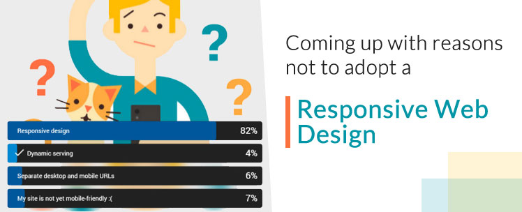
Coming up with reasons not to adopt a responsive web design
- By
- PostedSeptember 15, 2014
Actually not really, especially when on top of a fundamental shift in viewers behavior, you have other very compelling reasons to just design your website for multiple device viewing from one single data source.
Google Loves It:
Nothing can beat this first and foremost reason. Google has publicly advocated the use of responsive web design, as it adheres perfectly to their high standards of high-quality content and a clean link structure.
Responsive web design uses a single URL , which makes it easier for Google to crawl, index, and organize the content of a website. Additionally, Google recommends responsive web design because a single URL makes it easier for users to interact with, link to, and share your content that lives on your website. Also, users need no redirection to get the device-optimized view of your site, which reduces the web page load time.
Enhanced User Experience:
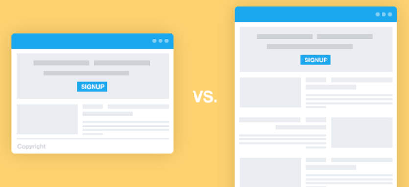
One of the most appealing aspects of responsive design is its flexibility to adapt to any hardware device and screen size. Rather than shrinking images and text to fit to the screen, a responsive website fits into the frame provided, giving your users a seamless and optimal experience. Best of all, a website with responsive design has an excellent navigation control through which users can easily access any kind of content without any scrolling or resizing, no matter where they are and which device they are using.
Cost of a responsive web design
When responsive web design was not introduced, web developers used to create multiple versions of a single website for multiple devices. They were needed to put a lot of efforts to make an update to a web page, and also required to maintain a separate mobile domain for a site. For a mobile version, there was a need to have a separate mobile code base.
In theory it is more expensive then a non-responsive design. Reasons being that it takes more planning to do a responsive design, that certain design elements need to be adapted for multiple views and that testing the site takes longer as it has to be viewed on multiple hardware devices. And unless you have done a redesign in the last year chances are that you will need a complete overhaul of your design. In another blog I am elaborating on the cost of a responsive web design.
Improved SEO and only One SEO Campaign
Another benefit of responsive web design is it makes your site search engine optimized. According to Pierre Farr, Google Webmaster Trends Analyst, responsive design is preferred over mobile templates by Google for better SEO. A responsive website has one single URL, which doesn’t only make it easier for search engine bots to crawl your site, but also reduces the chance of on-page SEO errors. If you’ve a separate mobile version of your desktop site, then you’re required to run and manage two separate SEO campaigns for both. Whereas with responsive web design, there is no need to run two different SEO campaigns for your desktop and mobile site at the same time. Instead, you just require incorporating mobile-specific keywords into your responsive site, and running a single SEO campaign to promote it. This is the main benefit responsive design has over a separate mobile template.
Great for Blogging and Social Activities:
If you’re an inbound marketer and have incorporated elements of social media and blogging in your marketing strategy, there is no doubt that your site has been getting a lot of traffic from mobile devices. A recent ComScore’s report cites that 55% of users log into social media sites on mobile devices. Needless to say, if you have a responsive site and sharing out content links, you’re not only going to experience high conversion rates and low bounce rates, but also a loyal audience.
It will Adapt to Future Devices:
One of the hidden but most prominent benefits of responsive design is that it is 100% future-proof. While developing a responsive website, the size of the template is designed to adapt to screen-size, instead of a device. This means your website will always render properly on whatever screen size it will be visited in the future.
So, in the future, when new devices – such as watches, TVs, glasses, etc. – will be introduced, your responsive website will continue to look amazing and beautiful. All you need to do is to simply update your content, ideally on a very regular basis, instead of building a new website every year.