Is Responsive design the choice for E-commerce
- By
- PostedFebruary 28, 2015

However, many e-commerce companies are still skeptical of responsive design as a solution to the multi-screen problem. They are concerned with how responsive design will affect the customer experience and overall website metrics.
To help answer the question of whether responsive design is a good choice for enterprise e-commerce companies, this post includes a high-level overview of:
- Why some enterprise-sized businesses are embracing responsive web design to consolidate their web strategy.
- The risks of responsive design for e-commerce retailers.
- Whether it is possible for implement responsive design successfully in an e-commerce environment.
1. Why some enterprises are choosing to ‘go responsive’
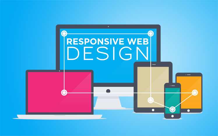
The promise of responsive design is that it dynamically adapts websites to different screen sizes (across desktop, tablet, phablet and smartphones), using one set of code.
The advantage of this approach is that the website’s core content, features and business logic remain the same across each device, while the presentation layer of the website adapts to, say, increase text size, make buttons bigger, or change the grid structure.
For many companies, this is an immensely valuable benefit. It means that companies can serve their customers’ needs across any device platform while simultaneously eliminating the need for separate mobile and tablet sites.
The technical efficiencies can be remarkable. Web operations teams become empowered to simplify their site development processes, and benefit from having no additional overhead in the form of managing redirects or mobile proxies.
And while the initial development overhead of responsive design projects can be high, the final product is usually a website that works great across devices.
(If you’re looking for examples, just check out this gallery of well-executed responsive websites.)
2. The risks of responsive design for e-commerce websites
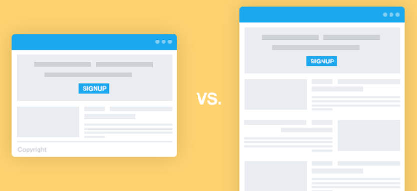
When the goal of a website is to let customers educate themselves, responsive design is a fantastic way to create a positive and consistent user-experience across all devices.
However, when the goal of a website is to drive conversions, reflowing the same content and features across devices can make it difficult to create a successful shopping experience.
Indeed, the core benefit of responsive design – that it results in a consistent experience across desktop, tablet and smartphone – means that by definition it isn’t optimized for conversions on each and every platform.
And in an age where mobile is responsible for up to 50% of a website’s traffic, optimizing conversion rates across each platform is now a non-negotiable activity.
3. Is it possible to create a high-converting responsive e-commerce site?
For an e-commerce company to successfully implement a responsive design, the business team needs to be empowered to own conversion rate optimization across each channel.
Fortunately, some retailers have already solved the problem. Take consumer technology retailer Garmin:
Garmin is a responsive e-commerce site that is also flexible to ongoing conversion optimization across each device.
Contrast Garmin’s website with the Leatherman example. On Garmin’s product page, the team has brought all of the important information and features above the mobile fold. Even the shopping cart flow – traditionally a high-abandonment point for mobile users on e-commerce websites has been heavily optimized for smartphones.
Conclusion
So, is responsive web design a good methodology for e-commerce retailers to consolidate their multi-screen web strategy?
Definitely.
At Mobify, we believe that it is very much the future of the web, and we’re not the only ones; Google loves responsive web design, too.
However, e-commerce websites pursuing the responsive approach need to understand that the actual responsive design is only one aspect to the strategy.