UX Principle: How to Design your Homepage for eCommerce site
- By
- PostedSeptember 15, 2015
Everything has a user-experience: may it be a drive in Porsche, may it be using iOS 9 on your iPhone, or may it be using a website. As a UX designer, the challenge you face is to provide the best UX and least hindrance as possible for the user. UX design (UXD) involves a lot of research to understand the user and how they behave on the website.
For an eCommerce website, it's important to target users subconsciously and homepage is the first thing users see and experience, and on a subconscious level decides if it's a good website or not. So, a homepage must be designed well for the users to enjoy their experience on the website, which will eventually lead to building a better relation with the user.
Homepage
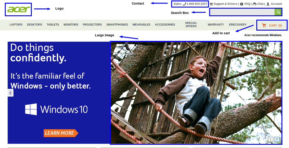
#1. Large Image and Search Box
Most e-commerce websites today will greet you with a large image slider to give you preview of their best products, latest deals, and discounts. Clean, high quality images of the image slider with white background puts the focus on the product in the image.
Also having a search bar is essential for the user to easily type and look for their product with ease without having to apply 5-10 filters to search their product.
#2. Navigation Menu
Navigation menu gives user an idea of the range of products available on the website. Most users come to e-commerce site to browse before they can make their decision, so make navigation menu prominent and keep 6-7 main categories.
- Don't clutter the navigation menu with more than 6-7 choices.
- For most e-commerce websites, navigation menu on the top works well but you can also keep one on the left side.
- Show the navigation menu on most of the pages, even when you scroll down, make sure it's visible.
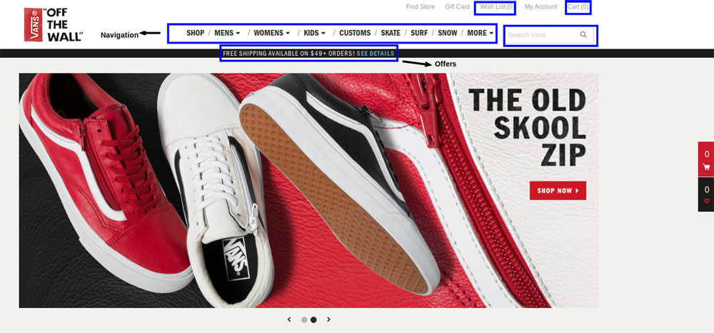
#3. Logo
A good logo can help your customer create a positive impression of your brand. So a good prominent logo whether on the top left corner or in the center is a must and add your company's tag-line below it, and it should be functional. Clicking on the logo should land the customer on the home page.
#4. Shopping Cart
Shopping cart should be easy to access and must display the number of products added to the cart. If you add three distinct products to the cart, the cart should display prominent number 3 on it, like a notification.
#5. Wishlist
When a user browse through products, let's say a user is looking for a nice pair of jeans. He types 'Jeans' in the search box. The result displays all the jeans available on the website, then the user uses filter for his gender, waist size and colour preference. The user must also have the option to sort the products by: most popular, high price to low, low price to high, new, or discount. Through these small steps the user can now see the type of jeans he was interested in.
As the user scrolls down and keeps checking the number of jeans, he can add the one's he like to the wish-list and check them later or make the payment later, if he's not ready to buy yet. It's important to note that product should remain in wish-list as long as user doesn't remove it.
#6. User Account
Give your users their private account where they can store their personal information like: name, address, credit/debit card information, email, last order details, status on the current order, discount coupon, etc.
It's important to know that customers love personalized shopping experience.
#7. Track Order
Fast and easy access to tracking their order is such a useful tool for the customer to keep track of where their product has reached, and how much time will the product take to reach their home or office. Rather than going through the whole process of sign-in, check your account, click on last order, check last order and click on it, and then see the details ─ make it more convenient for the user by putting a 'Track Order' button on the home page.
#8. Customer Care Contact Details
By simply adding the customer care phone number on the homepage, you tell your customers that you are there to help them and it establishes a trust between the user and the website. But keep note that you have enough staff to help the customers, and don't forget to specify the days and time to call. Else the user will feel irritated and agitated if the problem isn't solved right then and there. We've all has been in that situation. And as I write, I'm talking to customer care with one of the world's leading brand, who seem to have lost my return package and haven't initiated the return process from last 10 days.
Conclusion
Optimum UX can be a hard thing to achieve but it's under constant evolution, as people use more and more e-commerce websites, it's helping UX designers to evaluate the users' behaviour and give them the best UX. For now, these tips above will keep your e-commerce website running well.
Author Bio: App developer and computer programmer of Xicom Technologies Ltd.- Android Application Development Services, Amanda Cline explains three easy, hassle-free ways you can develop high performing mobile apps.

