Web Design Trends for 2015
- By
- PostedSeptember 22, 2014
The trends that we saw in 2014 will be reinforced in 2015.
Responsive web designs, flat and simple web designs, less clicking and more scrolling, typographical art, larger images and saying more with less are all trends that were there in 2014. They will be further reinforced in 2015 due to the further increase of mobile and tablet usage and the need to have one content management platform for all your customers and viewers.
If somehow you did not jump on the band wagon this year, prepare to redesign your website in the latter part of this year, so you can follow the so much needed trends in web design for your mobile viewers. EXCEL REDESIGN TOOL is a useful tool that can help you managing a redesign process.
Trend 1 : Responsive web design is here to stay
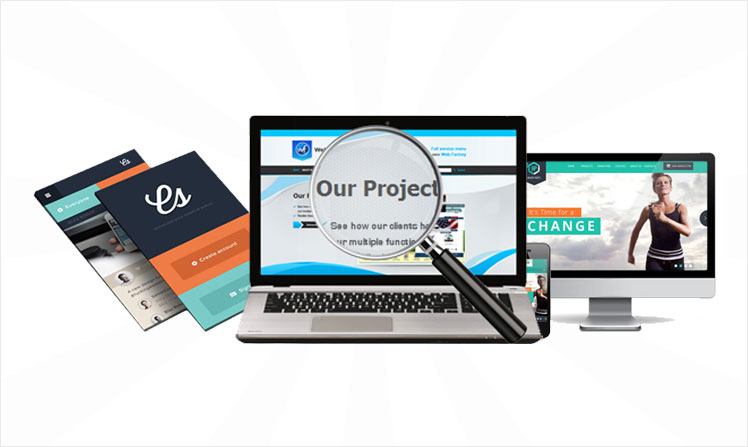
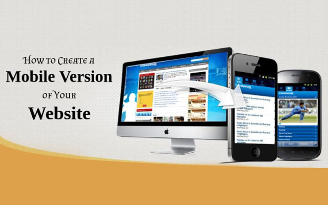
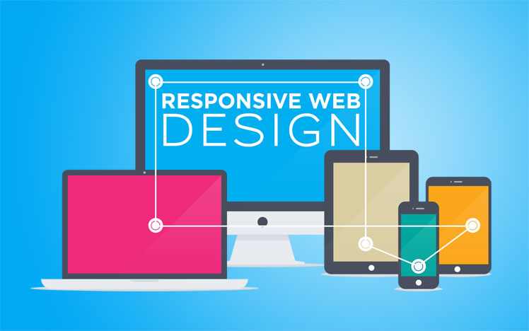
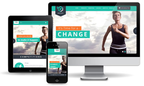
Already one of the major trends in 2014, this trend will be reinforced in 2015 and will most likely stay one of the major trends in the year to come. With the dominance of tablets and smartphones, not only for viewing content on websites, but for real time transactions, all companies and organizations that are taking the Net seriously need to invest in a website redesign and in a responsive website redesign. Instead of a trend, it becomes a must have for any company that wants to grow the business through the web and inbound marketing. No longer multiple updates of your content and underlying technology, do it once and it's done for all devices out there. The trend is also future proofed, and as many new hardware devices will be coming to market to view online content, a responsive website will be able to adapt seamlessly to all these new devices without updating or upgrading your underlying technology. Get on board whilst you still have the time.
Trend 2 : Less Clicking and far more Scrolling
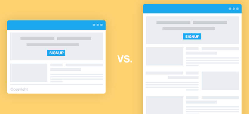
Bulky sites that fragment your brand’s story over dozens of pages are history. Users now expect to be able to scroll through all that you offer in a single page, rather than by viewing every single page of your site. While multi-page sites do harness more search engine marketing (SEO) power, designs that provide content in the form of a single page are winning the hearts of smart phone and tablet users. Create a blog and landing pages with distinct titles, keywords and content that compensate for the single page design. Blogs and landing pages are on inner pages that can enhance your online visibility quite a bit, and needless to say that these inner pages are responsive as well and therefore easily readable on a tablet and smartphone.
Trend 3 : Simple, beautiful and Flat
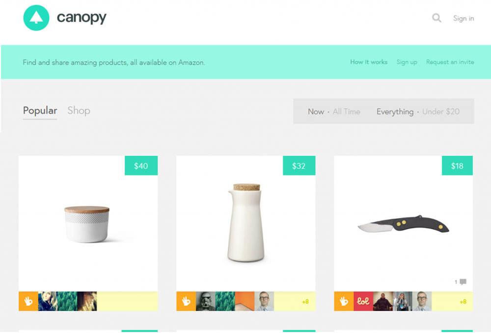
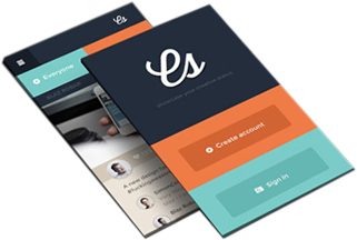
Swap your outdated textures, patterns, shadows, bubbles, and gradients for a focus on the sweet simplicity of flat design. As more and more site visits are happening on hand-held devices, designers are keen on building elements that appear smooth and minimalism on flat screens. Though flat design has been around for a while, brilliant and effortless flat user interfaces were on the rise in 2014 and will continue to be on the rise in 2015.
Trend 4 : Typography is King
What content is for your website, is Typography art for your web design. Typographic art is on the fast track toward the mainstream. High-quality fonts are now available at affordable prices to small businesses that have previously had to pay out the wazoo for complete font sets. Rich typography was already a trend in 2014 and will continue to be a dominating design element in 2015 and the years to come.
Trend 5 : Say MORE with LESS
As visual appeal becomes increasingly essential for the Internet, there has been a predictable decrease in text-heavy websites. Instead of telling your company's story in a paragraph or huge block of text, the focus has turned more into creative, visual storytelling. Text has been dramatically cut down to the bare necessities, while images such as icons, info graphics and large images, are employed to communicate important information. For the sites that are unavoidably text-based by nature, the trend is focused towards richer content experiences. Text combined with video, picture and interactive functionality is integrated to tell a story that will hold the attention of even most impatient users, like me!
Trend 6 : Larger Images and Infographics
Pictures have always been a fantastic way to express ideas online as is very apparent from the popularity of Instagram. An excellent design method is to utilize powerful images with text overlay as a way to quickly market ideas to users. When you consider the mobile user, a picture is more easily digestible than squinting at text. For the mobile medium a great picture is worth a thousand words.
Hand in hand with large images, info graphics are a great way to display a lot of information in one space. It will take a good combination of pictures and words to truly tell a story that is entertaining and informative, but when you do it right the results keep people hooked to your pitch because it is such a user friendly interface. There is even a science behind well-designed info graphics to make them more compelling.

