Website Trends for 2014
- By
- PostedSeptember 11, 2013
Like fashion and technology, the styles of websites and blogs you see would also evolve and change. Below you will find a list of expected web design trends in approaching 2014.
01. FLAT WEB DESIGN
It seems it is going to be yet another year of Flat Design and making stuff simpler and cleaner. This trend focuses on typography and the use of color, avoiding at the same time the unnecessary frills, textures and styles, effects like shadows, glows and so on. This type of design tries to concentrate the user experience on content by making a website easier to understand. In other words, Flat Design enhances the 2D screen at the expense of methods that try to make websites look more three-dimensional.
Examples:
- http://pragmaticlab.com/
- http://www.coletownsend.com/
- http://oak.is/
- http://www.stilld.nl/
- http://www.caramelbudgie.com/
02. PARALLAX SCROLLING
Scrolling effect rules in web design. Whether it is something simple like a header that changes its size after scroll or more fancy like horizontal scrolling content or parallax – scrolling is worth to consider while planning any website design. Probably the most impressive is the so-called Parallax Scrolling. It allows designers to control the depth of objects on their websites by controlling the scroll speed of different elements like images, headlines and others. It may be cosmetic or the core of any design.
Examples:
- http://www.noiretrenoir.com/
- http://webriq.com
- http://wagerfield.github.io/parallax/
- http://aform.lu/index.php?id=3
- http://kitkat.com/#/hardware
- http://speed-motion.com.ua/
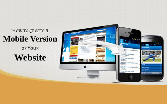
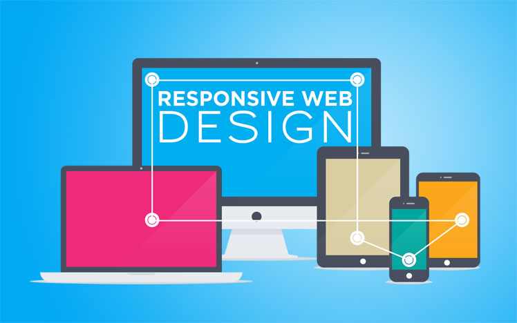
03. RESPONSIVE MOBILE DESIGN
I mentioned earlier how mobile devices can affect web design as a whole. Walker Sands, a public relations firm found that mobile devices account for 28% of total website traffic in Q3 2013, up 67% from the same time last year. Our numbers show that traffic from mobile devices now makes up nearly 60% of the total traffic on Hitched. This trend has been going up for years and will continue to do so in 2014. The way to design for this in the past was to create a mobile-specific website, but now websites have the ability to be more responsive and to adjust accordingly to the device and screen. This means publishers don’t need to maintain two completely different sites and can instead focus on just one that responds appropriately.
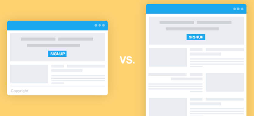
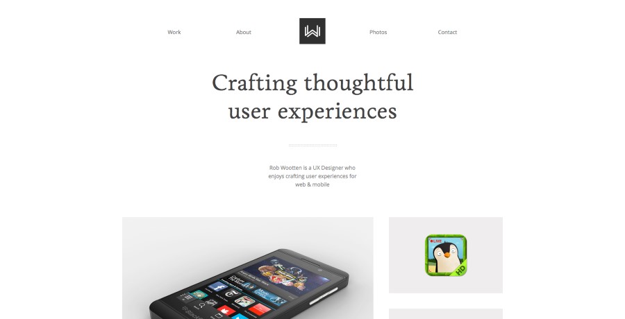
04. CLEAN AND SIMPLE
One step further after Flat Design in making things simpler is minimalism. We will see design continue to be simplified with single page websites, flat design, fixed headers and minimalism overall. First of all it is related to, content, focus philosophy and second of all – it is mobile friendly. Designs like these are elegant, clean, fast and easy to read.
Examples:
- http://minimalmonkey.com/
- http://www.justsmith.com/
- http://jordiensenyatdisseny.com/
- http://minnixio.com/
- http://wootten.ca/
05. WEB THAT RUN LIKE APP
The popularization of mobile devices has its own impact on web design trends. Responsive design and “mobile first” approach resulted in sites that can be used like an application. Probably the most popular example is Google Docs. With the simplicity and ease of use, we are likely to see more and more blogs in this format. On the other hand, this trend reveals itself in website navigation that uses mobile patterns – slide out menus in dashboard for example.The biggest advantage of this trend is that you can visit such websites on any device you use.
Examples:
The whole bunch of Google products led by the https://docs.google.com/ and https://plus.google.com/.
06. ANIMATIONS
With still growing capabilities of HTML5, CSS3 and the addition of pre-processors (SASS, LESS) and jQuery of course, we surely will see enhance of more and more astonishing animations. Used smart they can be this “wow” factor, that will make your website stand out. Additionally animations are easy to use (lots of open source “copy-paste” plugins out there) and increasingly mobile firendly.
Examples:
- https://layervault.com/
- http://symbolset.com/
- http://adamrudzki.com/
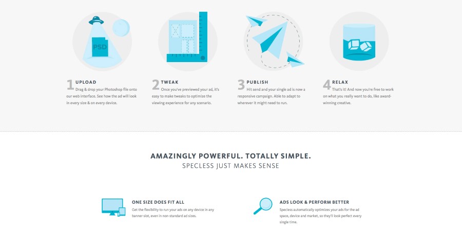
- http://gospecless.com/
- http://www.madebyblock.com/
This short list certainly does not close the topic and there are a lot more trends to consider. Still, it is a decent list and it’s worth getting to know with it! Just remember, trends come and go. They change, sometimes completely unexpectedly. You don’t have to go out and apply them all to your current web design straight after reading this article.