Website Trends for 2016
- By
- PostedSeptember 2, 2015
Trend 1: Unique Way of Using the Grid
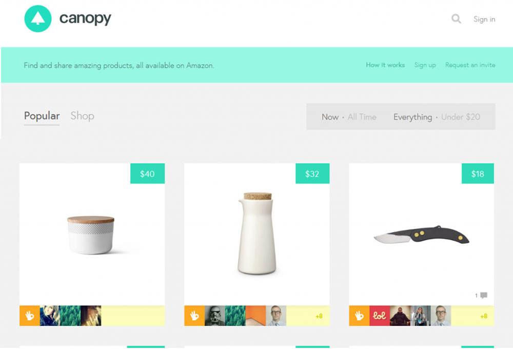
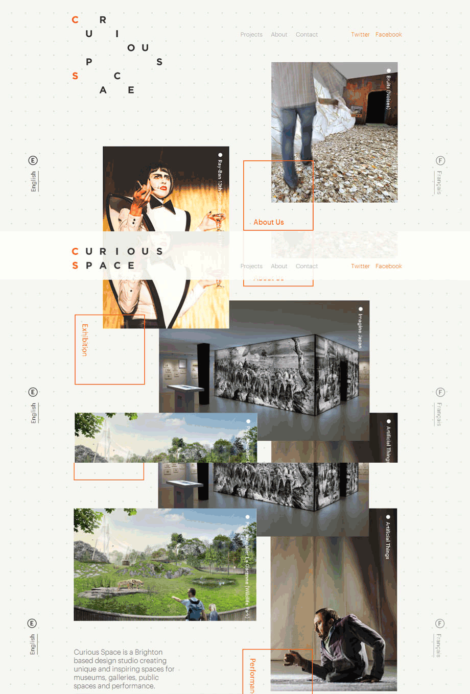
Curious Space’s website is a great example of adding a pinch of organic freedom to an ordered grid layout.
You’ll quickly notice the photos of this website stacked on top of each other. Stacking them isn’t a problem, as when a user rolls over on an image, the Z-index of the selected image shifts, so it is pushed to the top of the pile of photos.
Upon scroll, the haphazard arrangement of their logo falls into place to spell out their company name.
Trend 2: Custom-Drawn Illustrations
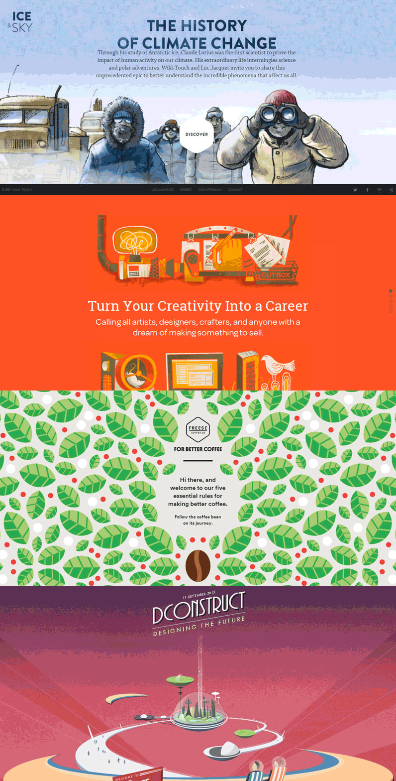
We’ve all thought it - “Why should I draw another [name of object] icon, when I can just grab it off an already existing vector pack from the web?” This line of thinking does save time and budget constraints, but how about integrating custom-made illustrations, or other artwork into the project budget in the first place?
Sites like Creative Freedom Guide, For Better Coffee, 2015 DConstruct Conference, or Ice & Sky all integrate custom-made / hand-drawn illustration work that greatly aid in telling their story and leaving a memorable experience for their users.
Trend 3: Cinemagraphs
Did that picture just….move? We love cinemagraphs because like videos and photography, it enhances the desired mood for a website and gives it an additional layer of wonder, mystique, and elegance. Unlike videos, it won’t eat as much bandwidth, and unlike photos, it provides “something more” than a simple still shot. This technology has been around for a while already , and we hope to see it integrated into more websites in the future.
Examples from cinemegraphs can be found here.
Trend 4: Semi-flat design
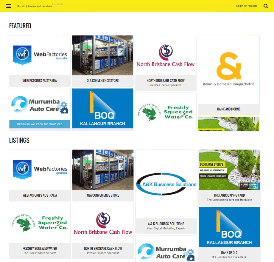
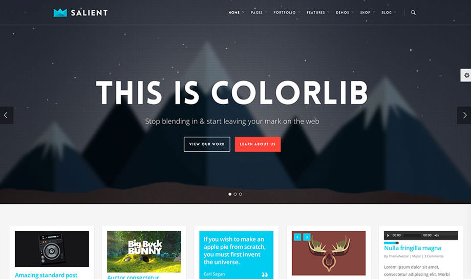
Flat design has slowly morphed over the past few years to semi-flat design. After Windows launched its Metro style, the design world became inundated with this trend. Unfortunately, this style did come with its usability pitfalls. This trend has slowly morphed into semi-flat design, largely in part due to both Android’s and Apple’s releases using this type of style. By integrating depth and dimension through the use of subtle shadows, card / tile concepts, and well-thought out transitions to help guide and orient users, semi-flat design aims to eliminate the problems that flat design had created.
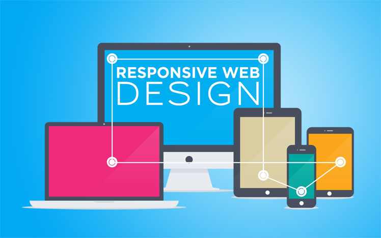
Trend 5 : Responsive Web Design
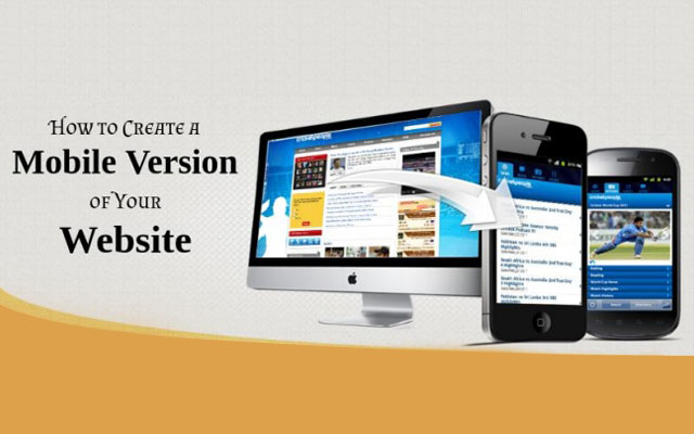
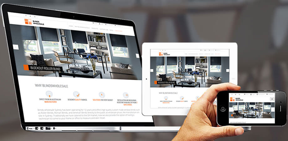
Let’s face it, after the implementation of RWD, there was no turning back. There will only be more devices sold on the market, so embracing and integrating responsive practices on websites will make the web sphere a better place for all.
Trend 6 : Lazy Loading
On websites that feed content continuously, Lazy Loading aids in viewing immediate website content without waiting for the entire page to load. This is especially helpful for websites that are highly visual, such as Facebook, Instagram, or Pinterest. In a society where information is constantly being fed into our lives, lazy loading helps to simplify viewing of said content by loading only small chunks at a time.
